I suppose the background you may need on this is that I am constructing a map as a part of my dissertation. Broadly speaking, I am generating a map to put the events and locations from my dissertation into a single place. And that allows me to answer some really cool questions. Like this one:
One of the best articles on the Flood of 1849 was written by Harry Kmen in 1947. I wrote a chapter draft for my dissertation on flooding for a writing seminar, and Kmen’s work was indispensable. Kmen ended his article with this:
In 1850, Mayor Crossman won re-election on a platform advocating consolidation [of the three municipalities of New Orleans] and two years later the three municipalities as well as Lafayette were brought together in a single corporation.
Harry Kmen, “New Orleans’s Forty Days in 1849,” Louisiana Historical Quarterly 40 (1957): 45.
And this caught my eye. I never forgot it. Flash forward a year and a half, and I am knee-deep in my map. So, I want to know, can I support that claim using qualitative, quantitative, and cartographic data?
So what if I could make a map that showed the area of flooding, overlaid with not only the divisions of the municipalities at the time of the flood and then the election results for 1850. So for that, I need:
- the flood area of the Flood of 1849
- the boundaries of each of the New Orleans Municipalities
- the election data for the mayoral election of 1850, broken down by municipality
The flood data and the boundaries were easy. I already had maps of each of those that I could use to generate shapefiles to put on my map. Here they are if you would like to check them out:
And in fact, these were already line items to be added to my map. So, the challenge became the election data. I cannot say for sure how many sources I scoured and came up empty-handed. (and here I scold myself for not being better about tracking what I search and where) And I was getting ready to give up.
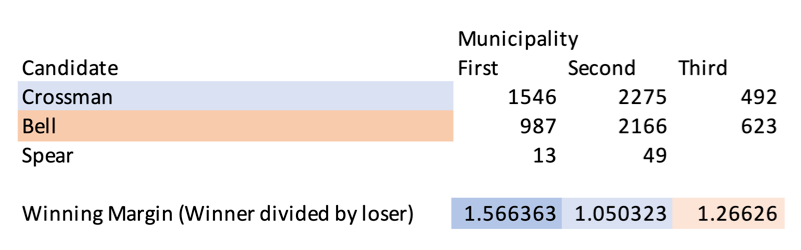
And then, I had a 2 a.m. epiphany, which, as we know, is when all the good ones come. I logged on to newspapers.com, and to my absolute joy, there were the election results. The number of votes for each mayoral candidate in the New Orleans election of April 1850. And by municipality, no less!
So now I had all of my pieces, and the first two were easy to get onto my map. Because they were maps themselves. But the election date was tougher. How do I present this data?
Well, the good news is that I was already working on the mapping code, so these just had to become objects that I could single out. For the purposes of this research question, I was making it the subject of a poster presentation, so while the rest of the map and code were in progress, we had to come up with something quick to get a map and an answer for the poster session, and it turns out that this would give us our proof of concept for the project as a whole.
After collecting the data and using a tool designed by UCLA, click2shp, we had the geometry of the municipalities and the election results. I had long since had the shape file for the flood itself, also from click2shp. It was now a matter of getting the election data into a format that would translate to a map.
So I used opacity. The lighter color is the smaller margin of victory for each candidate. The values became the alpha values, assigning opacity to the map’s fill area.
Mapped out, it looks something like this:
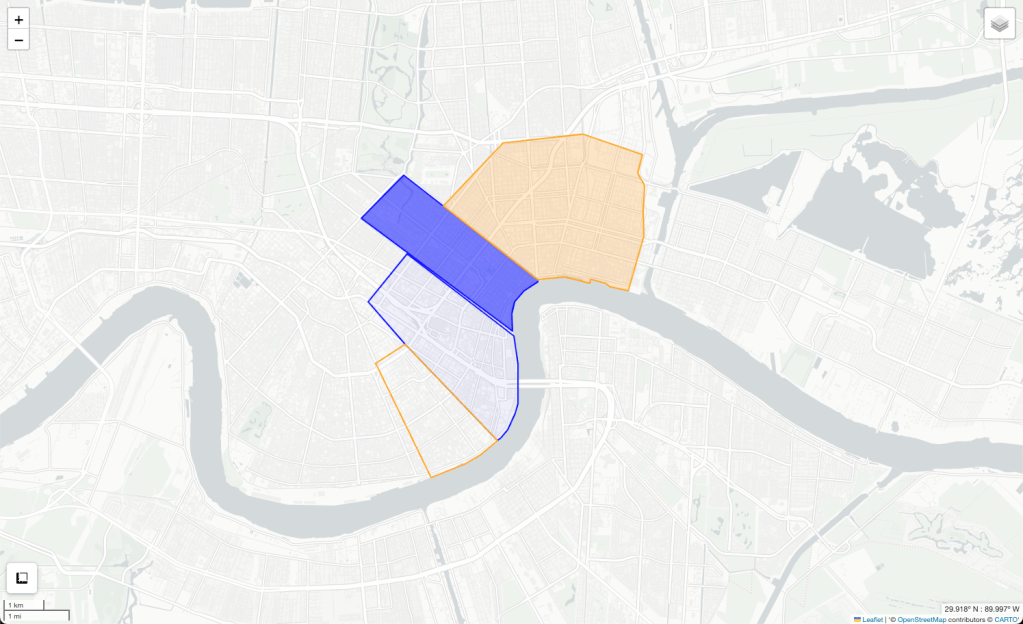
So from this, we can see that Crossman won by a lot in the first municipality, barely in the second, and not in the third. But where was that compared to the flood? So let’s map it and find out.
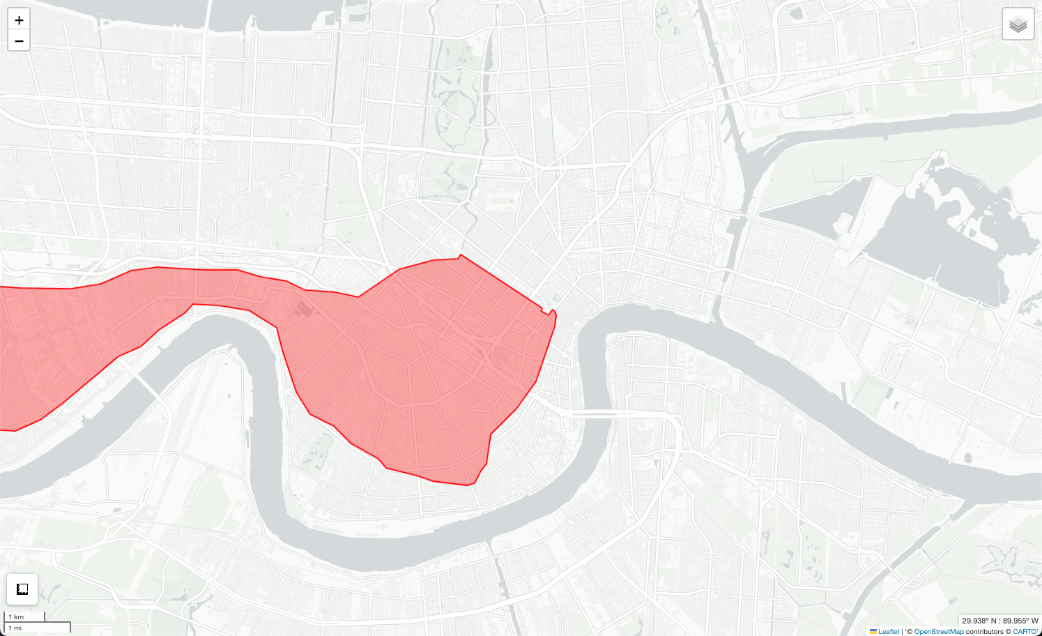
Of course, the flood covered a lot more than New Orleans itself because of where it began on the river, so the flood area looks like this:
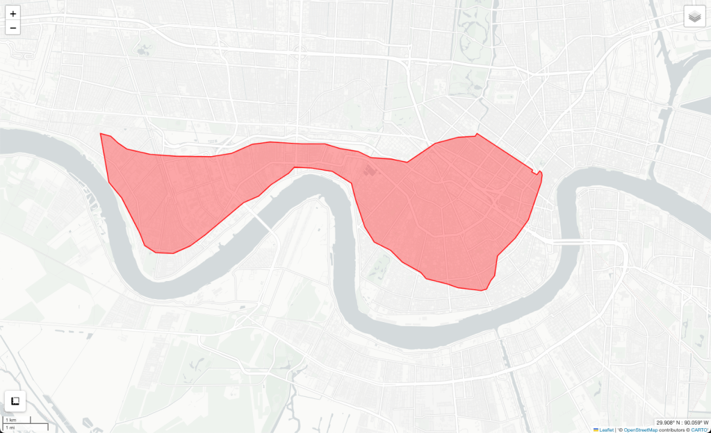
We only need about this much right now, so let’s zoom in:

And overlay the parts for the big reveal:
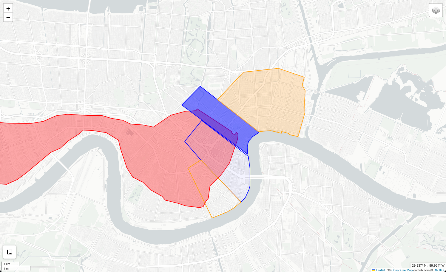
So, of course, producing this map as the proof of concept for the larger project was met with some internal shrieking of enthusiasm because this was the first time seeing the map with features on it in map form. But after that, it was time to take a hard look at what this map was saying:
Conclusion
We know that Crossman won the election, and the only municipality that he did not win was the third, which was, as we can see, not impacted by the flooding. So that does bode well for Kmen’s analysis. However, the district he won most assuredly was the first municipality, which was significantly less impacted by flooding, stopped by the Carondelet Canal, than the second municipality. Here, more than half the district suffered severe flooding, yet Crossman’s margin is so small, only about 5% or barely 100 votes. It’s an overused cliche that correlation does not equal causation, but based on this visualization of the data, I would say that while it is true that Crossman won the election and it is true that Crossman campaigned on a promise to unite the municipalities, I would be reserved to say that it was this policy that won him the race. I would say that an equally contributing factor would be that Crossman was the incumbent candidate. or any number of other things.
This shorter post about using the project to answer a specific question, of course, leaves out a lot of the work that went into the project from a data collection and coding standpoint. But I do think that it illustrates how this type of mapping and data visualization can be invaluable to historical analysis, not to mention an engaging way to data collection and management strategies.
I am working on a full page on the site about the project, and at the time of this posting (October 2023) it is very much a work in progress, but I should have something there with the intention of adding to it as the project grows.
Update! – December 2023
For the purpose of creating a poster to show the capabilities of my research, the answer to this question fits. But what happens after that? Of course, I cannot simply take this conclusion at face value either.
While attending a history conference I spoke with many people about my mapping project and even got a chance to show them the expanded map we had been able to create with all of my features the week before. It generated a lot of buzz and I look forward to sharing it with the broader historical community, but to most of the people I spoke to about the map, I also talked about this smaller project.
We raised some of the following questions that should be investigated. For example, what were the populations of each municipality, and of that population how many were eligible to vote? Affluent areas, those less impacted by flooding would have, in theory, a higher voting population. But because they were also not as highly impacted, would a flood control measure such as reunifying parts of the city with such separate interests be something they would embrace. Conversely, those most affected and thus most invested in protection would have the desire to vote for Crossman on that promise alone, but may not be able to do so in such numbers.
Another thing to consider is the other candidate, Spears, and his position on flooding and infrastructure.
Sure, this type of conversation makes me feel less “done,” but at the same time, this community and collaboration that digital humanities allows us to engage with is one of my favorite parts.
